.jpg)
Pattern Play: Mastering the Mix
- carriagehousestudio
- 4 days ago
- 2 min read
3 Simple Tips to Blend Prints and Patterns with Confidence, Balance, and a Touch of Boldness
When it comes to design, mixing prints can be a daunting task for many, but with the right approach, it can become a fun and creative expression of personal style. Here are three simple yet effective tips to help you blend prints with confidence, ensuring you achieve a balanced and bold look that stands out.
1. Choose a Common Color Palette
One of the most effective strategies for blending prints is to select patterns that share a common color palette. This method creates a cohesive look, allowing different prints to harmonize rather than clash. Start by identifying a color scheme that resonates with you—this could be a combination of complementary colors or varying shades of a single hue. For example, if you have a floral print with shades of blue and green, you might pair it with a striped print that incorporates similar tones. This shared color base acts as a bridge between the different prints, making the overall outfit feel intentional and well thought out.

2. Vary the Scale of Prints
Another key to successfully mixing prints is to consider the scale of each pattern. Combining large prints with smaller ones can create visual interest and prevent the design from feeling overwhelming. For instance, if you opt for a bold, oversized geometric print on your walls, balance it out with a subtle, tiny polka dot pattern on your art. This contrast in scale not only adds depth to your space but also ensures that each print has its moment to shine without competing for attention. Experimenting with different sizes can lead to unexpected and beautiful combinations that showcase your creativity.
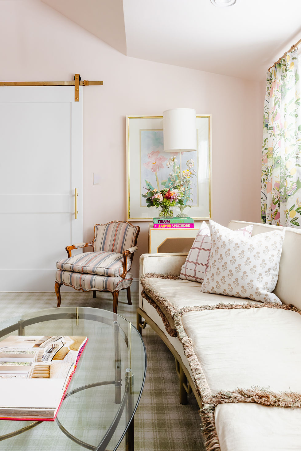
3. Incorporate a Solid Element as a Resting Spot
To further enhance the balance of your mixed-prints, consider incorporating a solid element that can ground the look. This could be a solid-colored throw, or a simple, solid pillow. The solid piece serves as a visual anchor, providing a break between the prints and allowing the eye to rest. By following these three simple tips—choosing a common color palette, varying the scale of prints, and incorporating a solid element—you can blend prints with confidence, balance, and a touch of boldness. Embrace the opportunity to express your unique style through the art of mixing patterns, and remember that design is ultimately about having fun and feeling good in your space.

As you begin to layer patterns into your own home, remember—it’s less about perfection and more about personality. Start small, trust your eye, and let your space evolve over time. The most beautiful rooms are the ones that feel collected, lived-in, and uniquely yours.
If you’ve been waiting for a sign to be a little bolder with your design choices, this is it. Mix the stripe with the floral. Pair the unexpected. Have fun with it.
And if you’d like a little guidance bringing it all together, I’d love to help you create a space that feels effortlessly layered and completely you.
Warmly,


Comments